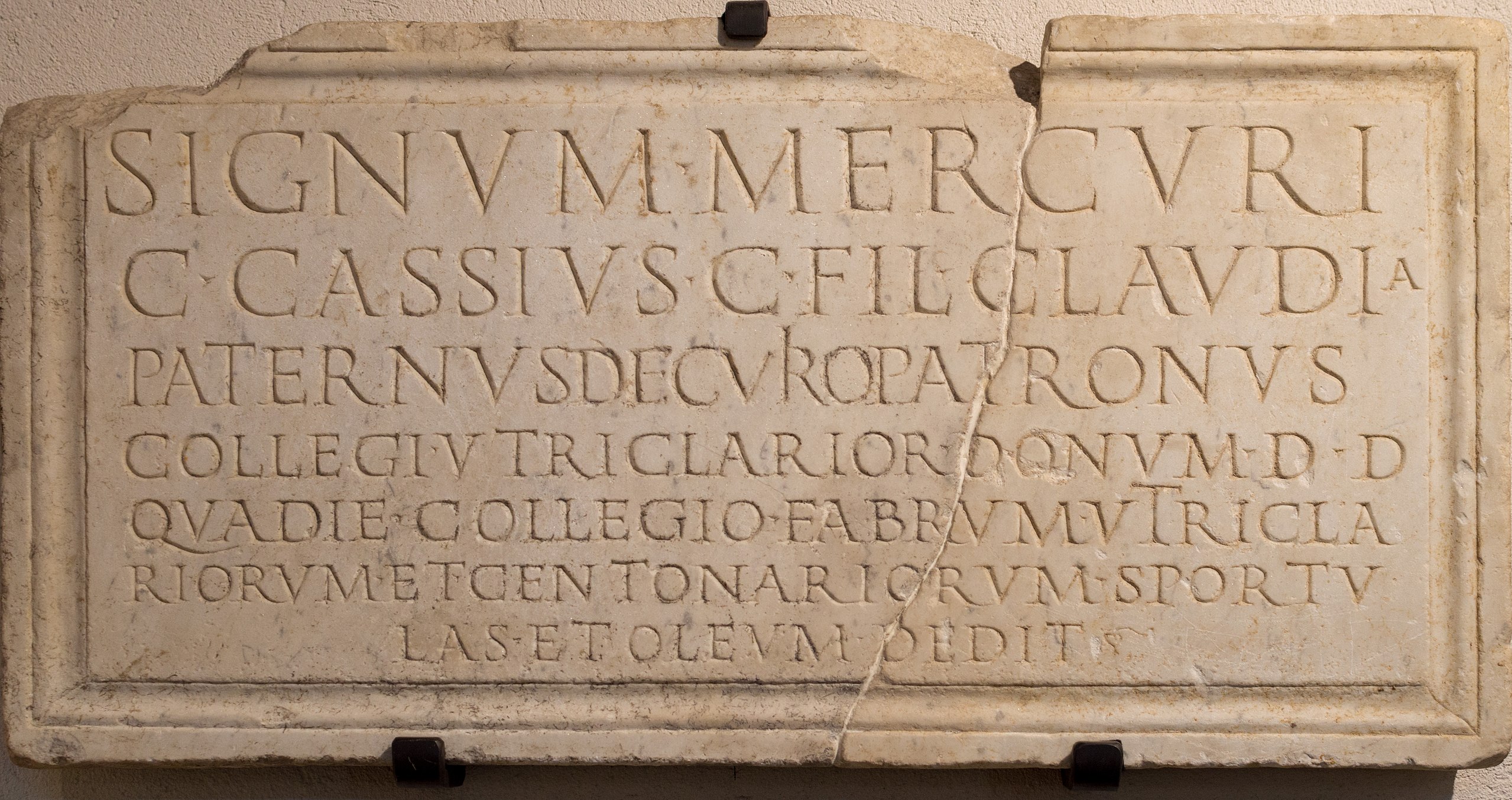
"Rubio's rationale, in simplified form, has three parts. First, serif typefaces are said to better communicate professionalism, formality, and authority in official documents (¶¶ 6-8). Second, using a serif typeface aligns with the White House, the courts, and the State Department's own historical practice (¶ 9). Third, the 2023 decision was a "cosmetic" gesture associated with diversity, equity, inclusion, and accessibility (DEIA) politics, and the reversion a correction to that (¶ 10)."
"Frankly, most people likely view both of these simply as "standard typefaces" without distinguishing much difference between them. So why would an institution of the State Department's scale bother, twice in three years, to take a stance on something as seemingly trivial as a default typeface? John Gruber, an Apple-sphere blogger with a well-known appetite for political commentary, obtained the full text of Rubio's memo and published it. (It is worth reading first.)"
On December 9, Secretary of State Marco Rubio issued a memo titled "Return to Tradition" requiring all State Department documents to switch back to 14-point Times New Roman, overturning a 2023 directive that adopted 15-point Calibri. Rubio's stated rationale emphasizes that serif typefaces better convey professionalism, align with the White House, courts, and departmental historical practice, and correct a change framed as a "cosmetic" DEIA gesture. The action aligns with broader rapid reversals in the current administration, including Executive Order 14151 directing agencies to terminate DEIA-related offices and activities. The shift illustrates how aesthetic standards can carry political and institutional consequences.
Read at neverland
Unable to calculate read time
Collection
[
|
...
]