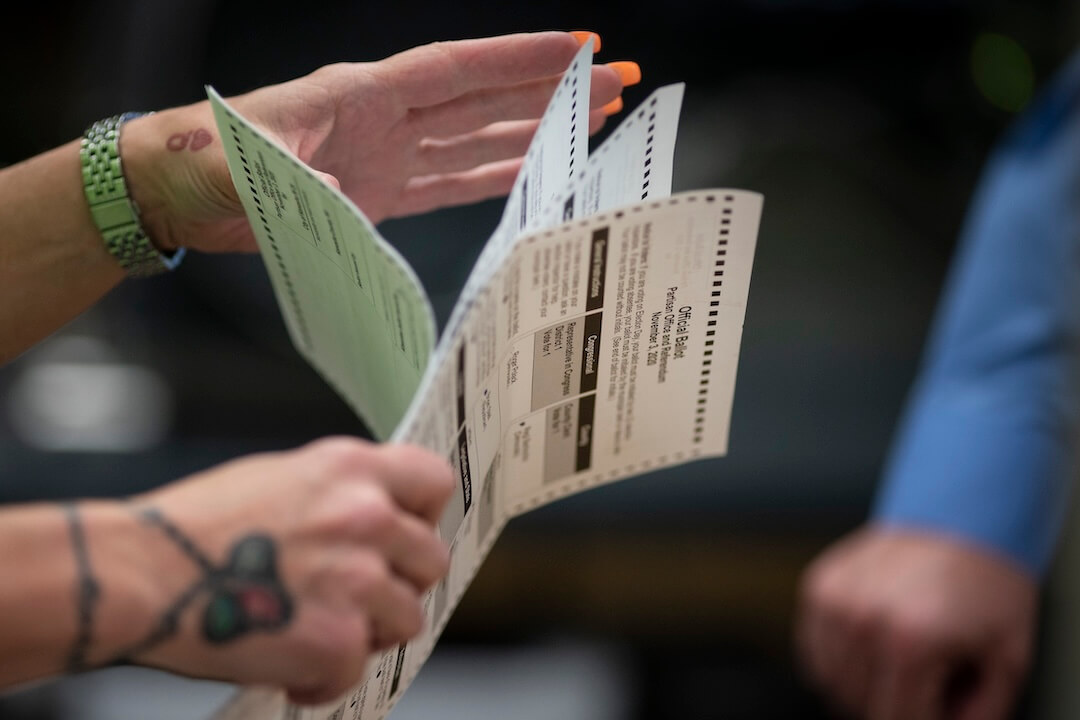
"The chart showed the vote totals over time for Wisconsin. At first glance, it appeared that Joe Biden was lagging far behind Donald Trump and then suddenly surged ahead to a tie. Almost immediately, people online seized on the image, claiming that all those Biden votes were actually evidence of fraud. In fact, it was nothing of the sort, and both Trump and Biden's votes had increased - the result of a large batch of absentee and mail ballots being counted all at once."
"Despite the best efforts of our team and others to fact-check and add context, the chart took on a life of its own - one that has outlived FiveThirtyEight itself. As a reporter who covered disinformation and conspiracy theories, I kept encountering it long after the election was over. Misinterpreted and split from its original context, it became more than just a piece of disinformation and is now a symbol of a broader conspiracy theory."
A chart of Wisconsin vote totals showed an apparent late surge for Joe Biden, but both Biden and Trump saw increases when a large batch of absentee and mail ballots was counted. The image was widely shared online and was misinterpreted as evidence of fraud. Efforts to fact-check and provide context failed to stop its spread. The misinterpreted chart persisted as a symbol within broader conspiracy narratives. The incident illustrates how easily visualized election data can be detached from context and weaponized. The prevalence of disinformation and the rise of AI tools create new challenges for protecting accurate reporting.
Read at Poynter
Unable to calculate read time
Collection
[
|
...
]