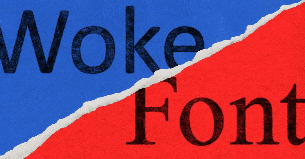
"Marco Rubio here, with an important announcement: No more Calibri in official State Department communications! Get out of here with your ungarnished lines and provocatively naked terminals! The Biden administration may have shot the serif, switching from Times New Roman on the grounds that serif-less fonts such as Calibri are more accessible to readers with disabilities. That's all over now. The State Department Action Request reads:"
"Some further updates to our font preferences: The Justice Department will be switching to Comic Sans because current fonts have a veneer of professionalism that feels out of place in communications written by Lindsey Halligan. Now all "fundamental misstatements of law" ( a judge's words, not ours!) will be in a font where they will feel more at home. The Department of Transportation is switching to Goudy Old Style to fix everyone's biggest problem with air travel: The fonts aren't square enough!"
The State Department is returning to Times New Roman as its standard typeface to restore decorum and abolish a DEIA program. The change is justified as reversing a prior move to serif-less fonts like Calibri that were presented as more accessible to readers with disabilities. Other agencies receive satirical font assignments: the Justice Department to Comic Sans, the Department of Transportation to Goudy Old Style and phasing out Clearview on road signs, and NASA adopting a logo-style A. The Treasury plans a symbolic switch to Akkadian cuneiform in honor of Ea-Nasir.
Read at The Atlantic
Unable to calculate read time
Collection
[
|
...
]