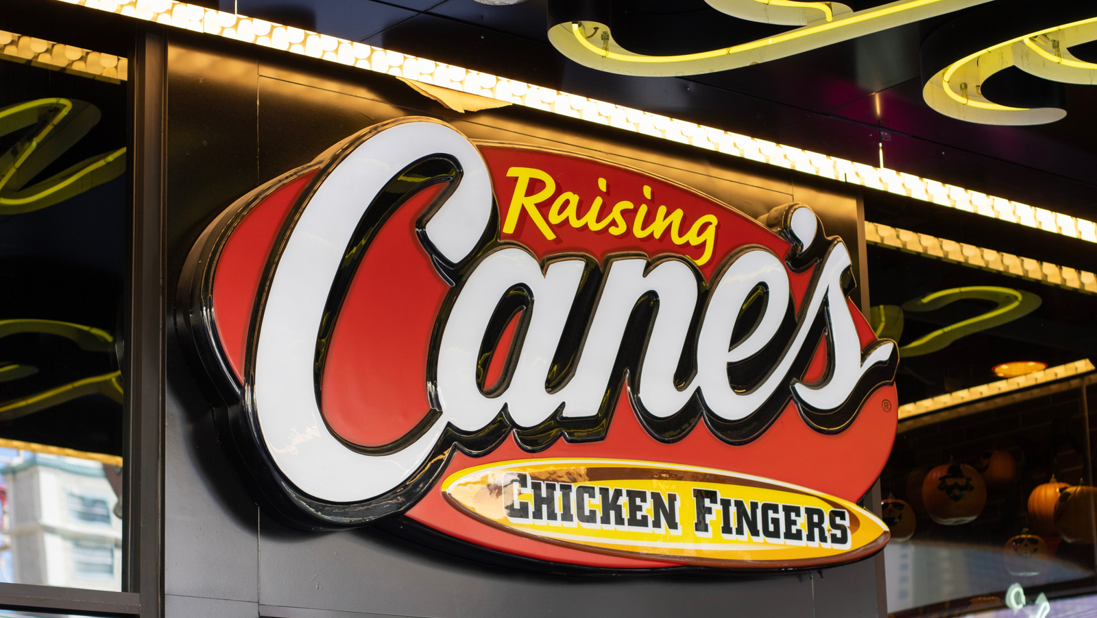
"Creating a successful company logo is a multifaceted magic trick, combining marketplace wisdom with personal intuition and a splash of creativity. Most restaurants start from scratch, hoping the design resonates with customers - but that's not always the case. The founder of one beloved fast-food chicken chain got an unusual gift of logo inspiration when remodeling a building. While uncovering traces of history and mystery, entrepreneur Todd Graves discovered a fascinating mural from which the logo of Raising Cane's arose."
"To say the old bakery needed design intervention seemed an understatement on many levels - but Graves soon discovered the building already harbored a wealth of components for aesthetic success. While demolishing a stucco wall, they suddenly uncovered a well-worn Wolf's Bakery mural holding the perfect faded red-brick color palette with flowing white letters, and a tattered yellow tagline declaring "bread at its best.""
Todd Graves financed his restaurant by working in oil refineries and commercial fishing, saving earnings and securing an SBA loan to open a chicken restaurant. The first Raising Cane's location occupied a deserted Baton Rouge bakery near LSU. During renovations a well-worn Wolf's Bakery mural was uncovered with a faded red-brick palette, flowing white letters, and a tattered yellow tagline reading 'bread at its best.' Those discovered visual elements inspired the Raising Cane's logo and established a mural-driven aesthetic that continues across locations. The story links Southern fried chicken tradition, grassroots entrepreneurship, and found visual history shaping brand identity.
Read at Tasting Table
Unable to calculate read time
Collection
[
|
...
]