"It has been over a decade since Domino's undertook a full brand refresh, and these are fraught times for such change. But if you fear that the pizza chain might be headed toward the sort of catastrophic feedback that befell Cracker Barrel's recent attempt to change its logo, well, this one definitely isn't going to make the same kind of splash."
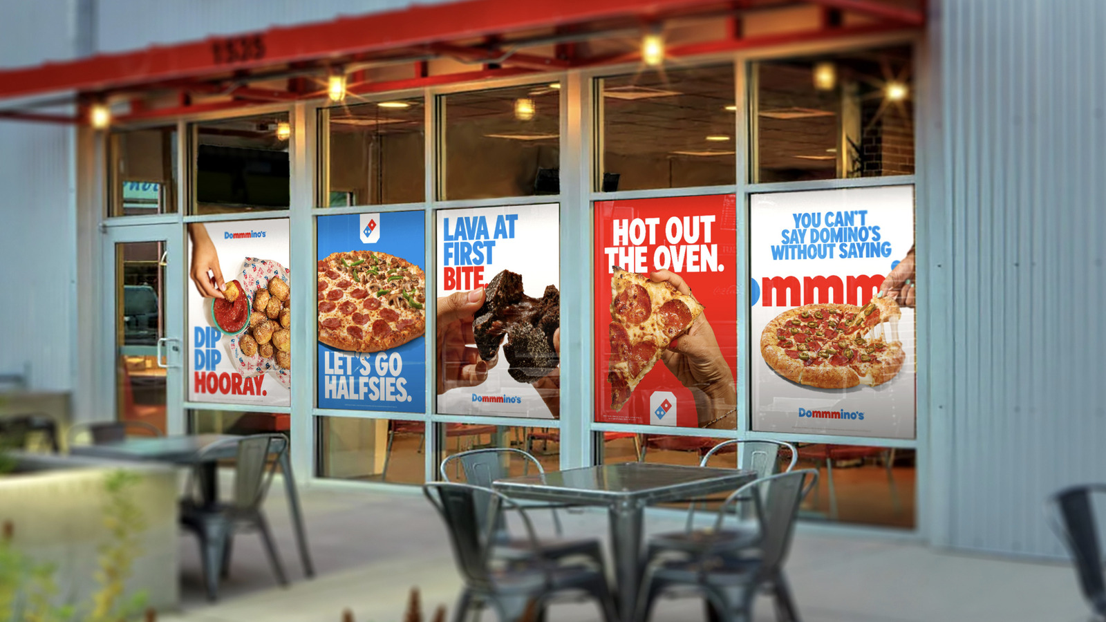
"Listed among the new brand elements in Domino's press release are a new "bolder" font, brighter packaging and hotter colors (are those not essentially the same thing?), and what the pizza chain is referring to as both a "name-bending jingle" and a "cravemark," apparently meaning that it hired Shaboozey to cram a couple of extra M's into the middle of the company name. It is not what you would call inspiring stuff."
"According to the extensive market research conducted during this rebranding campaign, just 67% of individuals prefer the new look, with slightly higher numbers in Gen Z (73%) and Millennials (70%). Of those latter two generational groups, 77% apparently found the new jingle to be "catchy," but catchy is certainly not the same thing as "good" or "enjoyable to listen to."
Domino's completed its first full brand refresh in over a decade, introducing a bolder font, brighter packaging, hotter colors, and a modified jingle described as a "cravemark." The refresh includes a name-bending jingle with extra M's inserted into the company name. Consumer research shows 67% overall preference for the new look, with Gen Z at 73% and Millennials at 70%. Among Gen Z and Millennials, 77% found the jingle catchy, though catchiness was distinguished from being good or enjoyable. The refresh avoided severe backlash and registered as modest and uninspiring rather than radical.
Read at Tasting Table
Unable to calculate read time
Collection
[
|
...
]