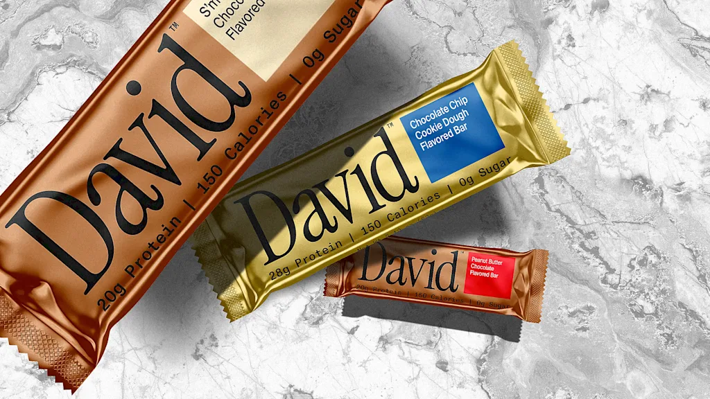
"Where other protein bars sport colorful, energetic packaging with bold fonts and crisp product imagery, David bars come in sleek gold packages with a serif wordmark and a few simple macronutrient descriptors. Instead of vying for consumer attention with eye-catching graphics and silly ads, David shows up online and in the real world with a distinctly minimalist aesthetic and serious, no-frills brand voice. It's an approach that founder Peter Rahal describes as "anti-marketing"-but, counterintuitively, is actually a highly effective marketing tactic."
"Rion Harmon, executive creative director of the creative agency behind the David brand, Day Job, says an atypical ethos has guided the creative from the start: "[The brand] should not be your best friend." "Every brand was trying so hard to win you over, to be just like you," Harmon says. "David didn't care. David was here to be effective. To design solutions. To create a superior product, with a superior brand.""
David uses a stark minimalist aesthetic across packaging and advertising, favoring sleek gold wrappers, a serif wordmark, and sparse macronutrient descriptors. The brand ran a print campaign featuring plain images of bars set against wide white space in the New York City subway system. The founder characterizes the approach as anti-marketing, and the creative agency emphasizes an ethos of not trying to be the consumer's best friend. David rejects colorful, energetic fitness tropes in favor of a serious, no-frills voice focused on effectiveness. The strategy has catapulted David into the cultural zeitgeist and major protein-bar relevance since its debut.
Read at Fast Company
Unable to calculate read time
Collection
[
|
...
]