I'm a midweight designer looking to step into another job elsewhere but I keep hearing so many conflicting things about portfolio formats and I don't want to have to recreate three versions all on different platforms just to apply for a job. I can't find any solid advice on what agencies are looking to see regarding format and if sending a PDF makes you look dated.
Musée d'Orsay hosted an exhibit last year called "Art is in the Street," which cataloged "the spectacular rise of the illustrated poster in Paris during the second half of the 19th century." The prints were lithographs - drawings made on limestone with greasy pencils, which were then exposed to water and inverted onto sheets of paper. Typically, each color got its own stone. The finished product was a firework of oily yellows and reds.
Pantone's Color of the Year Concept: The Pantone company produces the Pantone Matching System (PMS) and the Pantone Fashion, Home + Interiors (FHI) System, proprietary color spaces. PMS is used primarily in graphics for printing, packaging, and digital media. FHI is used in a wide range of other industries including fashion, cosmetics, fabric, plastics, and paints. When Pantone PMS inks are applied to a physical color reproduction process, it is frequently possible to accurately match the colors from your digital data visualization to hard copy output...
Federico Seneca (18911976) emerged as one of the most influential graphic designers of the early 20th century, known for fusing avantgarde artistry with commercial clarity. As art director for Perugina and later Buitoni, he reshaped Italian advertising by replacing literal imagery with bold, metaphordriven visuals. His most iconic contribution was the Baci chocolate identity, inspired by Hayez's *The Kiss*, featuring two lovers silhouetted against deep midnight blue. Drawing heavily from Futurism and Cubism, his work embraced geometric forms, dramatic contrasts,
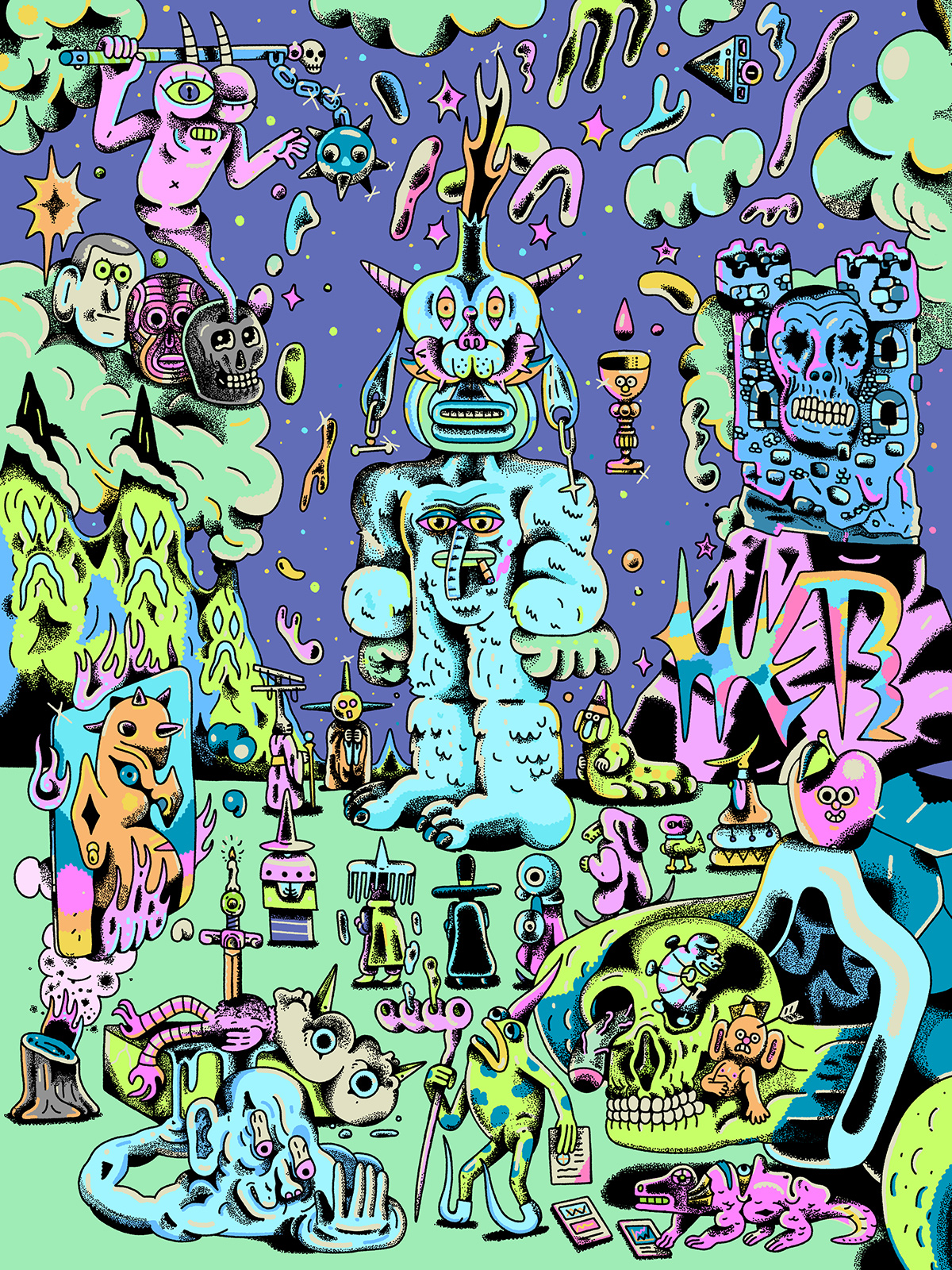
At the event, you can expect talks from Daniel Savage, a multi-disciplinary artist, designer, and animator whose work often focuses on exploring modular animation systems and process-driven work. As well as that, the graphic designer Sarah Elawad will be joining the stage to share the process behind her ultra-neon and kitsch graphic work which celebrates beauty, love and her culture through experimental prints, garments, video art and collage.
Each pet expresses their own personality; the illustrations are simple, yet tell us so much about each individual cat. Gomatsu captured each in a specific moment, and then amplified the action, expression or energy through his characterful drawings. Brown is holding a cold, rigid blank stare while 노호유 is caught mid-clean. Yuki has a mischievous grin, and Bao looks like a stern bouncer (definitely not letting you in).
The graphic designer and content creator James Junk took to the stage at November's Nicer Tuesdays in LA to share the process behind multiple areas of his creative work with brands, sustainability, fashion design and social media work.
A woman stands before a massive black wolf, their bodies aligned so precisely that the creature reads less as a separate entity and more as an extension of her silhouette. No tension exists between them. No drama of possession or escape. Mari positions the wolf head directly above the woman's own, along the same vertical axis, creating a visual grammar of doubling rather than confrontation. The relationship feels ceremonial, almost devotional, with the wolf serving as guardian rather than threat.
It's easy, for me at least, to be cynical about the state of design. Our visual environment can feel bland, everything from brands to buildings homogenized around similar styles. The ever-impending AI takeover can make the future of this work uncertain. My reading around design this year tended to focus on two things: looking back and looking ahead. In looking through design history, I was looking for glimpses of alternative ways of designing: the experimental, the absurd, the weird.
Barbara is an RC6300. Born in 1993, she's relatively old for a Risograph printing machine. She lived in a church basement in Beaverton until she was sold for $50 at an estate sale in 2013. A few years later, Barbara landed in the Kerns neighborhood at the Risograph print shop and studio Outlet-the shop's first, though Outlet founder Kate Bingaman-Burt has since added three Riso sisters to the family: Janet, Corita, and Lil' Tina.
Though best known for his psychologically intense " Übermahlungen," or overpaintings, Rainer's experiments touched on Surrealism, minimalism, and Abstract Expressionism, among other genres; throughout, he remained firm in his conviction that art should confront pain, suffering, and violence. Process, which he viewed as a meditative practice, was of tremendous import to him, and he frequently pushed himself to exhaustion to achieve the state in which he could best express himself.
She was producing these really precise, technical illustrations which were used in medical textbooks, says David Crowley, curator of a new retrospective of Schubert's work at Muzeum Susch, in eastern Switzerland. She was right in the middle of that practice She was totally unfazed about being in dissections. Her anatomical drawings, notes Marika Kuzmicz, the museum's curator, are still published in handbooks for medical students in Croatia today.
Minard would likely be unknown today, if Marey had not so aptly said his flow map of Napoleon's March on Moscow "defied the pen of the historian by its brutal eloquence." Funkhouser picked this up, and then Tufte anointed it as "the greatest graphic ever drawn". But in his time, Minard was just an engineer working for the École Nationale des Ponts et Chaussees (School of Bridges and Roads) in Paris. The corpus of his work lay buried in the archives of the ENPC.
Circa 1450, the creative community was jolted. The printing press had just been invented in Europe. Scribes, typically monks who had spent lifetimes perfecting the spiritual art of hand-copying manuscripts, saw their specialized skills suddenly rendered obsolete. Yet in short order, the disruptive innovation democratized knowledge, enabled the Renaissance, and created entirely new creative roles for editors, typesetters, printmakers, and illustrators.
Rea Irvin, the magazine's first art editor, is best known for creating Eustace Tilley, the monocled dandy whose upturned nose has graced our pages for a hundred years. Irvin established the stylish and refined look of The New Yorker, brought in countless new artists, and also penned many early covers that display his graphic mastery.
"It was fun dialing in the specific color to Justin's vision," Nusz told writer Andy Battaglia for Pantone. "Many people don't know that we see color through not only cultural biases but also through the lens of language. Color and language are inseparable. As we adjusted the color temperatures for the salmon (between cool and warm) and the hues that mix to make the color, we were careful not to make the salmon too red, too yellow, or too orange. When a color is more abstract, it's less pinned down by language-it opens up. As we perfected the color, it came to be defined by two words: Bon Iver."
I'm a newly minted RISOTTO fan, completely charmed by their paper goods - like their adorable Risograph calendar and their delightfully graphic prints. Their subscription, Riso Club, has been going strong since 2017, sending monthly artist-collab postcards to members. Now they're celebrating a huge milestone: the 100th issue! To mark the moment, they're publishing RISOTTOPIA, featuring work from Nathalie Du Pasquier, Peter Shire, and Barbara Stauffacher Solomon. A very fun celebration for a very joyful print community.
The British painter William Nicholson (1872-1949) has featured in several exhibitions at Pallant House Gallery in Chichester, West Sussex, in recent years. His complicated, much misunderstood, relationship with his eldest son formed the prologue to Ben Nicholson: From the Studio in 2021; four of his spare depictions of the South Downs were included in the gallery's 2022 survey of Sussex landscapes; and his shimmering The Silver Casket and Red Leather Box (1920) was a highlight of last year's anthology of Modern British still lifes.
The projects that Brodie takes on are created with a mix of digital and physical - his work shouts that hands are at work. Lady Gaga is stretched and made viscous for the cover of Mayhem, her sixth solo studio album, for which Brodie provided art direction and design, with creative direction from Mel Roy of mtla studio and Todd Tourso of Iconoclast.
When Otto Neurath died in Oxford some 80 years ago, far away from his native Vienna, he was still finding his feet in exile. Like many a Jewish refugee, the economist, philosopher and sociologist had been interned as a suspected enemy alien on the Isle of Man, along with his third wife and close collaborator Marie Reidemeister, having chanced a last-minute life-saving escape from their interim hideout in the Netherlands across the Channel in a rickety boat in 1940.
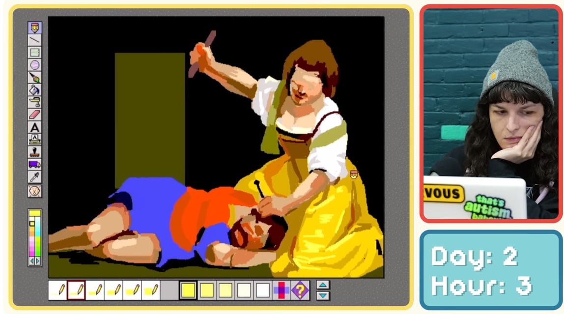
Twenty-five or so years ago, one day after school I went to visit my dad at his office. We didn't have a computer at home at the time so whenever I was around his, I would beg him to let me use it to play with MS Paint. I was probably around 7 or 8, and my go-to artwork was a portrait of my him made with the spray tool - perfect to recreate his short, spiky hair and stubble -
"So much of the work from this era is playful, stylish and full of personality. Despite printing constraints, artists still found ways to create illustrations full of wit and charm," says Zara. "The cheerful optimism and embrace of character, combined with individuality and modernist values, led to impactful, vibrant designs that still resonate today. According to the illustrator, its influence may be much more far reaching than we think: "Even illustrators who've never seen these originals are working in traditions these artists established."